
Baby Gear Exchange
UX Research | UX Design | Usability Test | UI Design

Overview: Kids need lots of clothes and toys as they grow and meet milestones. Baby gear pile up quickly and a service is needed to help pass them along to someone else who may need it. Many exchanges already exist but there are pain points that can be alleviated by more intuitive user interactions.
Role: UX Researcher, UI/UX Designer
Toolkit: Pencil & Paper, Figma, Sketch, Adobe CC,
UX Research
Overview
Background
Baby Gear Exchange is an end-to-end website and app where users can exchange things that they no longer need with those who might need it by:
Listing it
Pay for it
Arrange for a safe place for the exchange.
Research Goals
We want to investigate how people currently use various forms of “classifieds” so that we understand how users can exchange things though a website or app.
Methodologies
Competitive Analysis
User Interviews
Competitive Analysis


Feature Analysis

*Tracked Scheduling: users use the platform’s calendar to schedule a meetup and agree on a location on a map. This information can downloaded to users phone/personal calendar via .ics file. At the meetup, both parties can “check-in”. Platform can track user performance and give a rating on reliability or trustworthiness. Platform can also try to make sure the meetup is safe.

First notable pain point is the lack of schedule tracking if an item is to be exchanged in person. Users can direct message each other but it could lead to miscommunication.
The second notable pain point is the lack of assistance finding a safe location to make the exchange. People have different comfort levels when it comes to safety, however the service can go further by recommending sites that may be safer with a constant flow of public traffic or existence of security cameras. A mutually agreed upon location provides safety and a degree of anonymity that is beneficial to both parties.
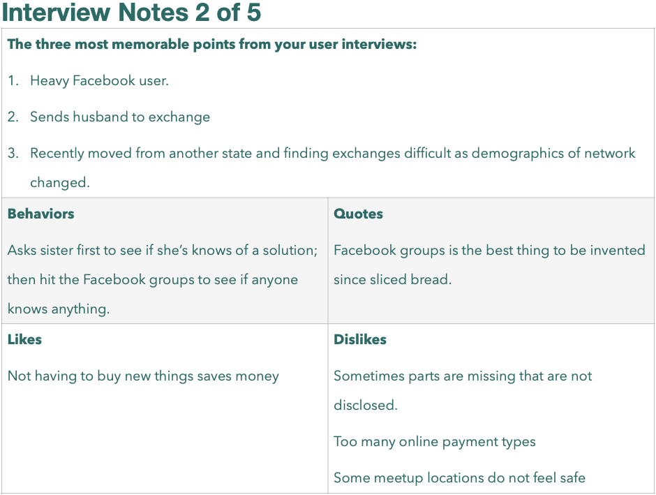
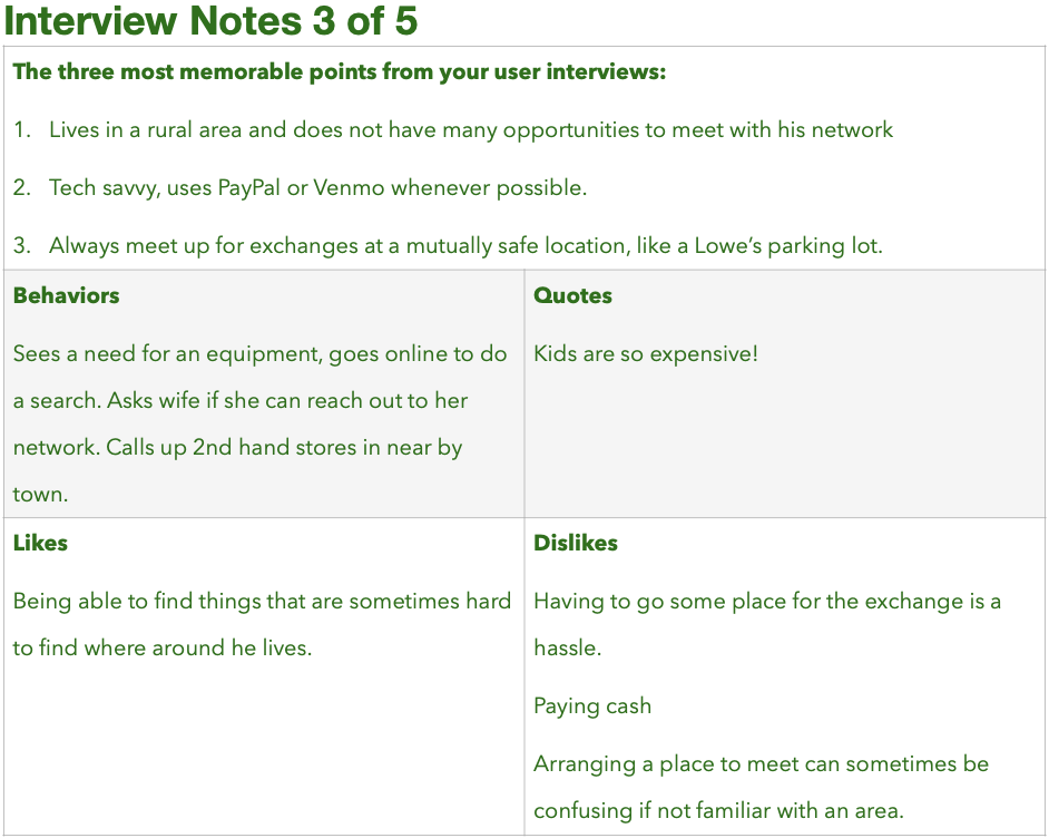
User Interviews
Overview
Five people were interviewed in person.


Affinity Mapping

Resulting Persona


Problem Statements
Jordan needs a way to list gear her kids no longer use so that she can recuperate the cost.
Jordan needs a way to buy used kids gear so that she does not have to buy it new, there by saving some money.
Jordan needs a way to communicate with the person doing the exchange to arrange a time and place to meet.
Jordan needs a way to send or receive money from the person doing the exchange.
UX Design
Information Architecture
Overview
Six people participated in a 72 cards card sort exercise to determine the main categories.
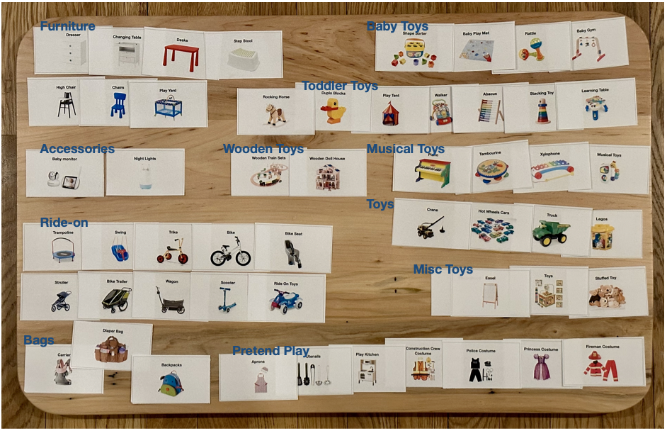
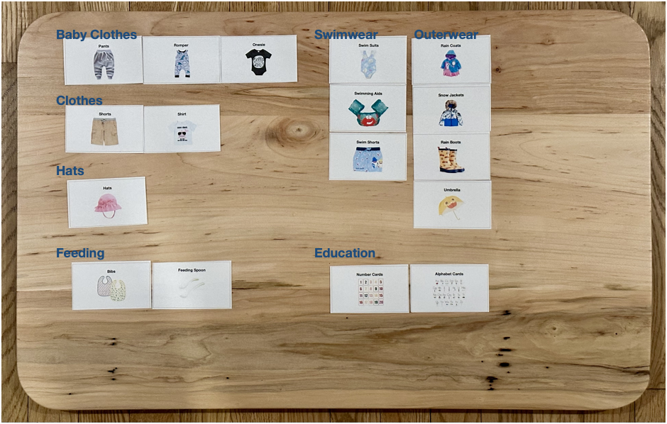
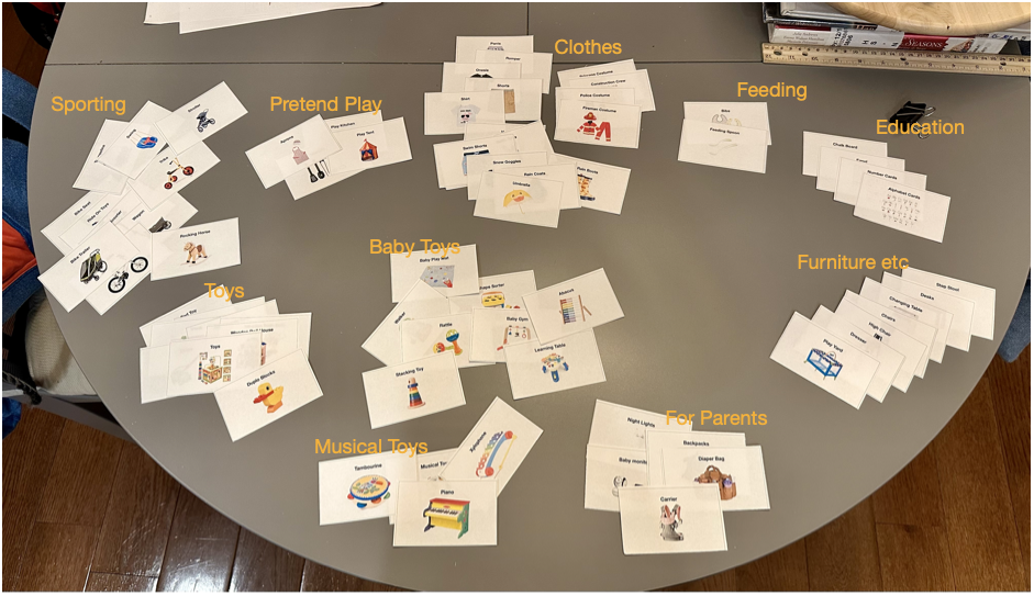
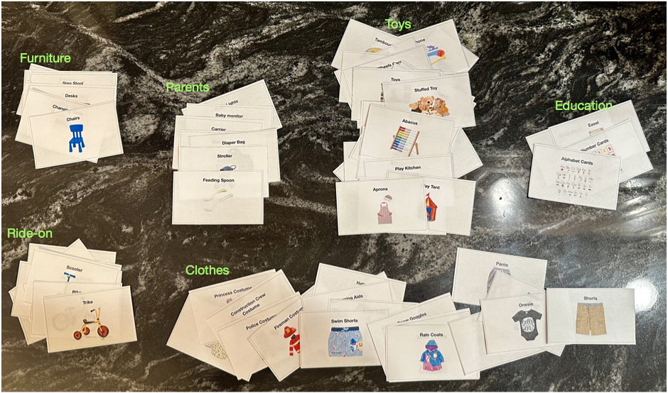
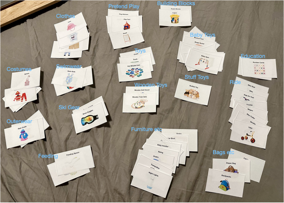
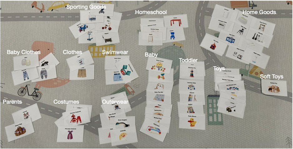
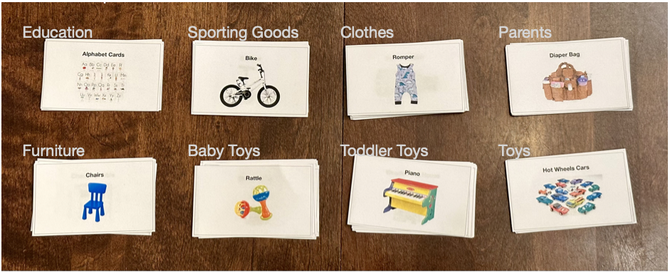
Resulting categories from card sort exercise.

A sitemap was built considering primary, secondary and tertiary navigations that incorporate results from the card sort categories.

User Flows

Wireframes
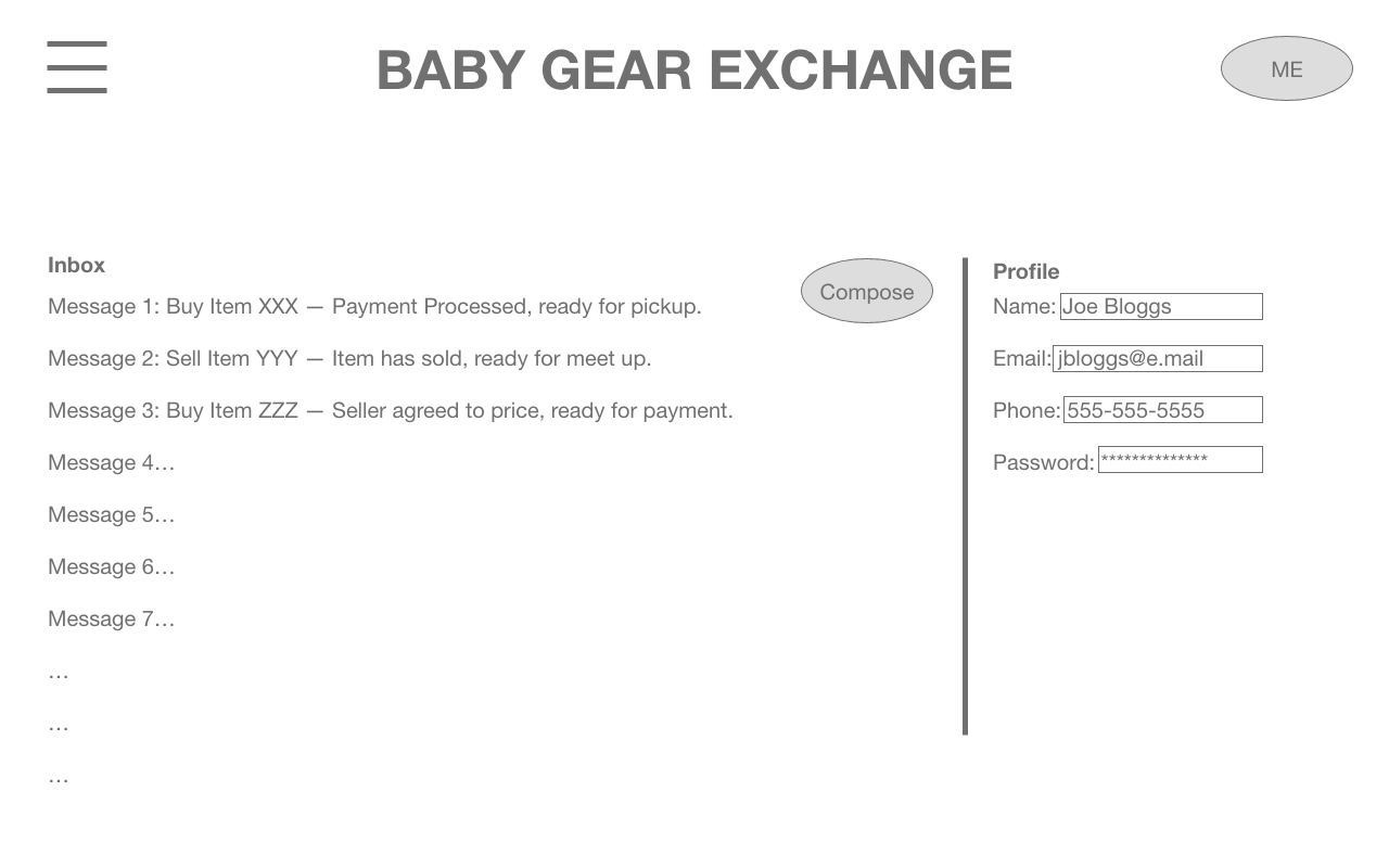
Rough Draft

The design of the Baby Gear Exchange website is to be lightweight and efficient — Bringing Craigslist’s simplicity to balance with eBay’s utility,
The three bars, universal symbol for “menu”, the site’s name, and the “me’/profile button should be available on all screens. The menu would be a quick way for the user to navigate to other parts of the site quickly. Whereas the “me” profile button would serve as a way to log-in/out, access to announcements and messages, and a place for the user to identify themselves to others.
The website should be fluid in its overall dimensions in a way that it can be viewed on a computer, tablet, or a phone. The small formfactor of the phone can then be a starting point for the app’s design development.


Usability Test
Objective
Testing the Navigation/Utility of the Website/App
Having the user navigate to buy something
Having the user navigate to sell something
Having the user edit their profile
Outcome
Success Rate
3/3 users succeeded navigating to sell something
3/3 users succeeded navigating to buy something
3/3 users succeeded navigating to their profile to change their zip code.
Description of Findings
Each user began with the homepage and tapped on the sell icon, found and tapped on the “new” button, and submitted a listing for sale.
Then the users tapped on the 3-bar menu and navigated to the buy section of the site and searched for an item, clicked on it to see more details, then clicked on the buy button.
Then the users tapped on the 3-bar menu again to tap into the profile page. They clicked on the edit button for their address and saved changes.
Analysis
While the users were able to navigate to the functions required with the menu on the top left, one expressed a comment about actually not seeing the homepage again.
Recommendation
Provide a “back” button so users can back out of a page if they clicked on something by mistake.

